

Oh wow! WE RE-BRANDED!
I'm so excited to share with you all this new re-brand I've been tirelessly working on these past few weeks. Here's a little snippet into some of the decisions I made for Birdie Barn as a brand and why...
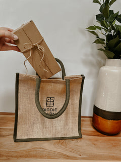
New Logo
For the logo, I hired the amazing graphic designer Kati Scalet (www.scaletpaperie.com). Kati's style is very similar to mine; minimal, neutral, yet oh so eye catching. I was having trouble designing a new logo for my own brand and new straight away Kati was the lady to help me! (Side note; asking other people for help is actually not that scary and I've realised I don't have to do it all on my own sometimes, Kati was a godsend!)
Kati sent me 3 concepts for logos and while they were all beautiful, 'logo 3' was the clear winner. I don't think Kati initially understood why I loved it so much but here's why: This is how 'logo 3' spoke to me and what I interpreted it as;

So the obvious part... 2 B's for Birdie Barn. No further explanation needed!

This part represents the apex of The Barn, where the business all started!

And the final surround represents our community; you guys! All of us enclosed together within Birdie Barn which I just love!
The logo also reminds me of a rune a little and being a Tolkien nerd that got me a little too excited...!
I also love that Kati made different variations of the logo, as I've come to realise one way just doesn't work. For example; it's great to have the wording set in a circle for social media icons, stamps and stickers but then its also great to have the wording standard, bold and simple to grab your eye in the way we have used it on this website.
Brand Colours
I also decided on 4 colour options for the brand, again neutral and minimal. If you know me this gal doesn't do much colour!
The colour options help me keep order throughout the website, stationery/packaging and also (I'm hoping) help our audience recognise Birdie Barn when they see those colours. "Oh that's Birdie Barns colour".
The first two names, 'Born' and 'Mark' are just a little random to be quite honest. 'Born' reminded me of something new and fresh and 'Mark' came because it looked a little like a mark...?
'Pullman' came from my new (very loved) green wall in my living room and charcoal is just charcoal.
Sometimes keeping things simple just works and I think this is proven here.

I hope you love the new decisions and more importantly, the whole new brand!
I'd love your feedback, please feel free to leave comments below :)
Leave a comment